Welcome to Compose. There's lots of stuff here, all about composing paintings.

Current entries appear in Dianne's weekly newsletter.


Friday, February 24, 2012

A Gentle Transition

To be suddenly awakened out of a sound sleep is unsettling.   In the same way, a painting that contains too many contrasting elements can feel like an assault on our senses.  But a painting can translate vibrant life in all of it’s diversity without visually invading the viewer.  One method for achieving this is gradation.

Arguably the most familiar of all the principles, gradation is a gradual transition between opposites.  Light changes slowly to dark, large continuously becomes small, one color gently unfolds into another. Any visual element—whether size, shape, direction, line, value, hue, intensity, temperature or texture—can be gradated just as it can be contrasted.

Most of us probably learned in our first drawing class that we use value gradation to make an image appear three-dimensional, but this principle is also a useful tool for unifying a painting.  An underlying value gradation ties together things that would otherwise compete.

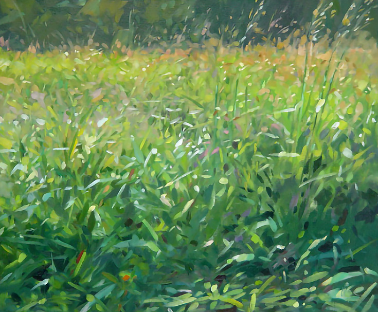
In his painting, "Growing Tall," Colin Page has used this strategy, unifying an otherwise unwieldy subject.


page 1
Colin Page      Oil on Canvas     "Growing Tall"

There’s a lot of activity here-- titillating flecks of light, rapid directional contrasts, quick gestures—but if you squint your eyes at Page’s painting and concentrate on the darks and lights, you’ll discover an underlying gradation in value.

Page's painting in grays and blurred.

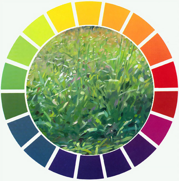
And he's used gradation in at least two other ways: look at the colors as they appear from the bottom to the top—blue-green, green, yellow green, yellow, orange—they all transition in the same order as the colors on the color wheel.

page colorwheel

Now shift your attention to the texture of the grasses. Larger, rather specific strokes appear at the bottom, and then strokes become progressively smaller and less defined as they move toward the top.

A portion of Page's painting in grays


Value, hue and texture all have been gradated, letting us be captivated by the diversity of contrasts rather than confused.

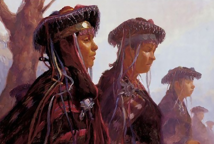
Gradation occurs naturally within the mechanics of our eyes.  Our visual perception interprets things as if they gradually change as they recede from where we are.  Things become smaller in size, lighter in value, weaker in intensity, and less distinct in texture and detail.  John Burton's painting, "Festival at La Tirana," adroitly illustrates this by exaggerating the principle.

burton
John Burton    OIl    "Festival at La Tirana"

Notice how within each subsequent figure these four elements--size, value, intensity and texture--gradually change so that the most distant figure is barely defined.

Carolyn Anderson uses the gradation principle in a similar way, but more strategically.

anderson 1

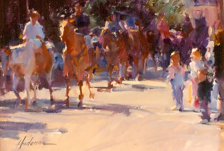
Rather than follow the gradation of subjects as we would normally perceive them, Anderson has guided our attention to where she wants us to look by more clearly defining the children on the right and the second horse from the left and gradating away from the discernible characteristics of these images so that, by power of suggestion, we can identify images in the distance even though their shapes are hardly identifiable.


Upper right section of Anderson's painting


As you can see, unlimited creative possibilities abound for using gradation as a tool in painting.  Whether the artist's goal is realism or something else, exciting and intriguing possibilities abound and more unified paintings will most likely be the results.

************
Note:  This tutorial is a revision of one I wrote for Empty Easel, September 9, 2008.

************


Friday, February 17, 2012

Say It With Strategy

What composing strategy do these four paintings follow?

Carolyn Anderson     Untitled

Qiang Huang    Demo at Sacramento

Joe Paquet     "Green Sea"

Jennifer McChristian     "Smoking Sugar"
Every genre has a host of methods for dealing with space. Individual artists seem to gravitate towards using particular strategies that fit their personal sensibilities.  Some poets, for example,  find their most authentic expression through the sonnet while others are more at home with haiku:  a simple three part poem of seventeen sound units can be every bit as powerful as fourteen lines in iambic pentameter.  Painters, too, select divisions of space that best communicate their ideas.   

All four of the paintings above use the same kind of spatial division--in each of them, areas occupied by the most activity make up one major shape while the background for that activity occupies the other. I find it intriguing that in two of these paintings, even though their subject matter is entirely different, there is an almost identical spatial division.

I have abstracted from these two paintings that spatial division and put it into Diagram A below.  The dark area represents main activity and the light shape represents background.

Diagram A
Can you find the two paintings from which I abstracted these patterns?   

The two remaining paintings share the same principle in a reverse pattern.  They, too, employ totally different subjects.  Here are abstract diagrams for these two works:

Diagram B
If you chose Anderson and McChristain for Diagram A, you are correct, leaving Diagram B as abstractions from Paquet and Huang.

All four of these paintings follow the L-shape composing strategy, meaning the artists have arranged the activity so that our eyes are guided through an L or reverse L directional path.

Subjects we consider for painting have a multitude of inherent qualities, giving us abundant choices of how we will compose them into our paintings.  We artists select what we will include and choose how we arrange and interpret what we see to express our response to the subjects.  The beauty of this is its power for giving artists so many options for manifesting their individual differences.

Friday, February 10, 2012

Rule Breakers

    Artists by nature tend to be rebels, especially against rules. Some have even created art movements by defying conventional rules. We need only glance back to the mid-19th century to find in the Impressionists the most scandalous rule-breakers in art history. They radically disobeyed the conventional rules of their time and eventually became the heroes of our day. But it was conventions they rebelled against, not composition principles.


Claude Monet   "Woman with a Parasol"  1875
Member of Impressionist Movement
There is a difference between conventional rules and principles of composition.  A conventional rule is an accepted guideline set forth by agreement among artists, but a principle of composition is a functioning law of physics that gives an art work order so that it can be read without confusion.  

One of these conventions that is not itself a principle tells us never to place an area of interest in the center of a painting.  This convention can be successfully defied by an artist who understands the principle of balance. Balance is a law of the physics with respect to equilibrium:  elements visually heavier on one side will overpower lighter weighted elements on the other.  

One way to defy the "never center" convention is to use symmetrical balance which makes one side of an art work a mirror image of the other.  Painter Georgia O'Keefe employed this principle in her painting, "Cow's Skull:  Red, White and Blue" and Leonardo da Vinci used in in his "The Last Supper."


Georgia O'Keefe    "Cow's Skull:  Red, White & Blue"    1931


File:DaVinci LastSupper high res 2 nowatmrk.jpg
Leonardo da Vinci    "The Last Supper"  Circa 1495


Another method for defying the convention of "never center" is to use radial balance where elements circle around a central area.  Henri Matisse used this principle in his painting, "Dance I" and Albrecht Durer used it in his etching, "The Lamentation"


Henri Matisse, The Dance (1), o/c, 1910 (MoMA)
Henri Matisse     "Dance I"    1909

The Lamentation 1513 - Albrecht Durer - www.albrecht-durer.org
Albrecht Durer  "The Lamentation"  1513
But the convention of "avoiding placement in the center" presumes assymetrical balance where elements on either side of an art work's center are of different sizes, colors, textures, shapes and values.  Nevertheless, an artist who has a working knowledge of the balance principle can find a way to place an area of interest in the center of the work, offsetting it with active elements around it.


Winslow Homer uses this tactic in his painting, “The Herring Net.”  Even though the event is right in the middle of the canvas, our eyes are drawn away from the center by the fish in the net on the lower right, the light reflecting on the water on the right side, angles of the oars, and the weight of the fellow hanging onto the front left of the boat.  And boats in the distance as well as the floating barrel in front help distribute the visual weight away from the center of the format.  


Winslow Homer    "The Herring Net:    1885
Mary Whyte did a similar thing in her painting, "Red."  The face of the woman is located dead center, but the bright colors of the hat and dress, the textures and movement of feathers in the hat, the weight of the dark background shape and the chair in the opposing corner, all carry a visual weight that balances the painting, enabling a visual flow throughout.


Red
Mary Whyte   "Red"   2008
"Rules of thumb" do work to prevent troublesome confusions from spoiling an otherwise well done painting, but artists need not be bound by them if a clever use of a principle can override the rule.  In fact, the more thoroughly we artists are able to understand how principles work, the more options we give ourselves for not only defying convention, but for finding creative ways to make our works more compelling.


Friday, February 3, 2012

Shadows Speak

If on a dark night the lights go out, there we are in total darkness unable to see a thing.  But can you imagine the dark going out? The impact would be the same--without dark, we can see no more than without light. To see we have to have both light and dark working in concert.  (Now, there's a metaphor!)

Light comes from a source, but its absence is the origin of darkness.  Without light darkness floods in from every direction, but darkness is given form called shadow when a light source is cast upon an object. Not only does shadow help define the object's shape, but it extends beyond that shape continuing in the direction of the light beams to create a cast shadow.  Even when light is diffused the location of shadows tell us the direction of the light's source.  In the photo below, faint shadows beneath the bird inform us that there is some light above it.


But when light is not diffused, we see two distinct images for each shape in it's path:  the object itself and its cast shadow. Direct light beams cause the cast shadow to bend and travel along the contours of anything in its path.  That shadow tells us the angle of the light beams, the shape of the object casting the shadow, and the contours of the surface on which the shadow is cast.

"Samwise"   Terracotta sculpture   Howard G. Hanson

It's the cast shadow that tells the story of this snow covered landscape.


If we switch our attention from the fact of snow and images in the snow towards the shadows themselves, we realize that it's those shadows that tell us about a slight incline of the driveway,  a rise on the right side and a drop-off on the left, that somebody has been walking in the snow and that there are trees nearby.

In fact, often the cast shadows will tell us about their surroundings without their images being visible.  Look at Karin Jurick's painting of a bike rider.


Now look at it (forgive me Karin) without the biker.


If while constructing a painting we ignore the specifics of a cast shadow, whether caused by direct or diffused light, we lose an important essence of the story that those particulars tell and we cause the painting to communicate that something is missing.   Rather than being added as an afterthought, carefully crafted cast shadows integrated into the painting from the beginning become an essential part of the painting's story.